It’s a history of hockey excellence and gold medal memories.
Both the logo & visual brand featured on this page, capture that emotion, pride, by visually representing our hockey heritage.
Hockey Canada
Art Director
Colour
■ 198/29/35, 10/100/100/10, 186 C
■ 135/120/81, 44/44/74/16, 871 C
■ 0/0/0, 20/20/20/100, Black C
Typeface
Copperplate Gothic (Bold)
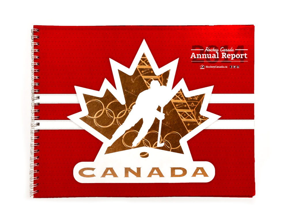
A versatile jersey texture and jersey stripe, represent the pride our hockey heritage.
Olsen Offc, Univere 59 Ultra Condensed, Fenway Park JF, Officina Sans ITC Pro
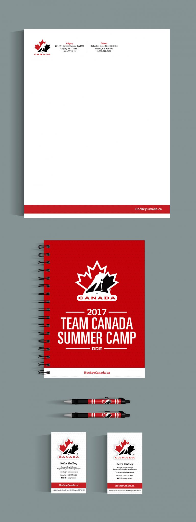
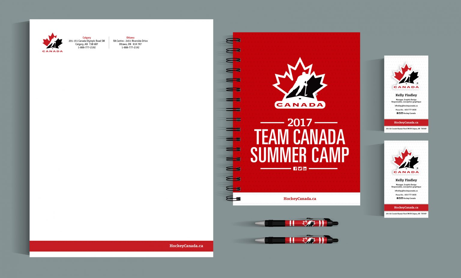
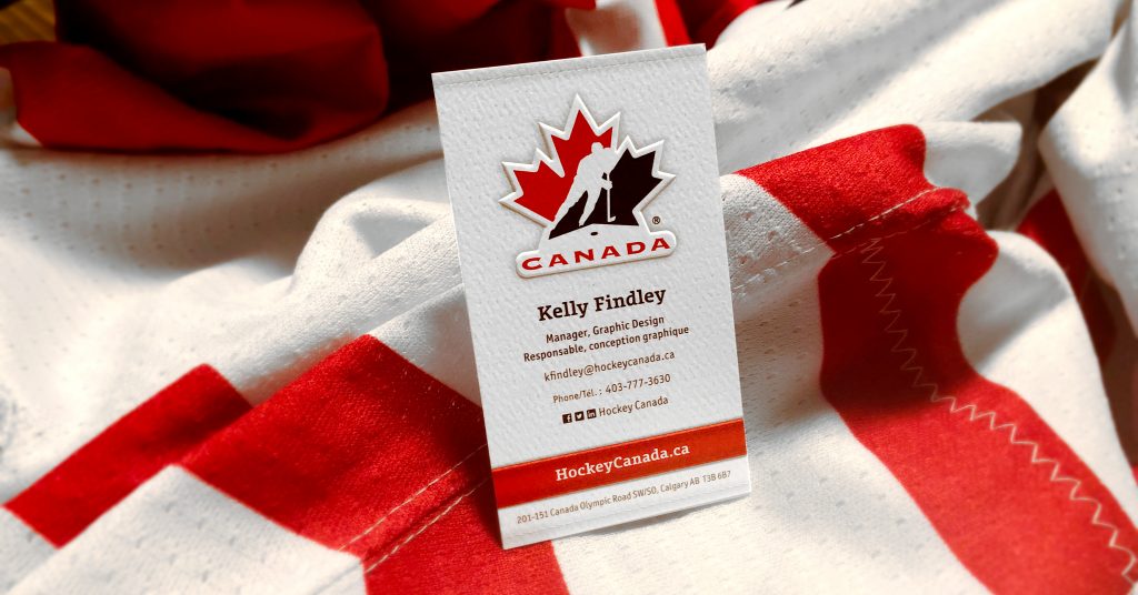
Stationary – Letterhead, notebook, pens and business cards.
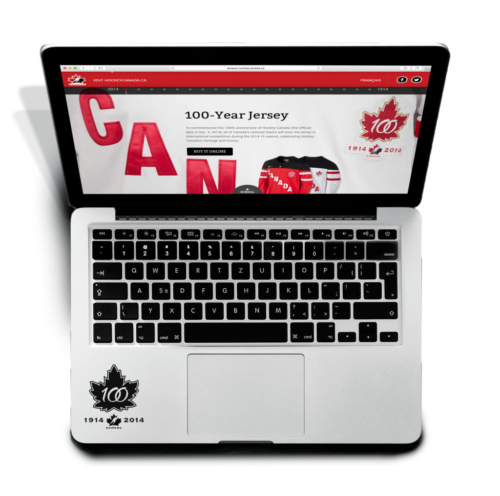
Website – Designed by an external vendor, this website features the red jersey stripe in the top nav.
Website – Designed by the internal team, this website features a robust red jersey texutre, and white stripe, and Olsen Bold in the top nav.
Business Card – Look at that subtle paper texture — the tasteful thickness of it. It even has an embossed logo.